Overview
A custom garment passes through four different people before it reaches the buyer, and every one of them needed a different app.
Sarto is a fabric-sourcing marketplace designed to connect fabric sellers and tailors with buyers: a seller dashboard for managing inventory, orders, pricing, and channel performance, paired with a mobile app for browsing designs, tracking orders, and managing the storefront on the go. I designed the complete product, end to end, for a private client, taken on directly rather than through an employer. "Sarto" is the working name used throughout design; the client hasn't registered it as a trademark, so the product may ultimately ship under a different name.
Problem Statement
Before Sarto, tailors and small fashion businesses were sourcing fabric the old way: phone calls, WhatsApp messages, and trips to physical wholesalers with no way to compare prices or check what was actually in stock. Sellers had no easy way to list their inventory online, and buyers had no single place to search across sellers. Both sides were losing real time and money to a process that hadn't changed in years.
- Sourcing ran on phone calls, WhatsApp and trips to physical wholesalers, with no way to compare prices or check what was actually in stock.
- Sellers had no practical way to list inventory online; buyers had no single place to search across sellers.
- A custom order doesn't move between two people, it moves between four: whoever designs it, whoever stitches it, whoever sources the fabric, and whoever delivers it. Nothing in the existing process tracked that chain.
- Fabric detail that matters to a tailor, quantity in meters, brand, conversion ratio, colour, was being relayed verbally and lost between handoffs.
Challenges
Designing one platform for five roles that each do a completely different job, the designer listing garments, the tailor accepting and stitching them, the fabric manager sourcing the material, the delivery rider moving it, and the admin overseeing all of it, without the interface turning into a maze of settings.
Fabric inventory is messy in real life. Different units, different naming conventions, different quality grades. Turning that into clean, searchable listings without losing the detail sellers actually cared about was harder than it sounds.
Buyers needed to trust a seller they had never met before placing an order, and sellers needed to trust that buyers would actually pay. Neither side had that trust built in yet, and the product needed to earn it.
Balancing a simple, fast ordering flow for buyers with the detailed inventory and pricing tools sellers needed, without making either side feel like an afterthought.
Solutions
Designed five distinct dashboards from one shared design system, so each role saw only what was relevant to them while the whole product still felt like one product, not five different apps stitched together.
Built a structured listing flow with guided fields for fabric type, quantity, and grade, so sellers could list inventory quickly without losing the detail buyers needed to make a decision.
Added seller profiles with order history and ratings, so buyers could see a track record before committing to a new seller they had never worked with.
Designed a streamlined checkout for buyers alongside a more detailed order management view for sellers, so both sides got an experience suited to what they actually needed to do.
Design Decisions
01Put the designer and the tailor in one app behind a mode switch
What I didGave the app a single persistent header chip that flips between Design Mode and Tailor Mode, swapping the whole tab bar underneath it (Home / My Design / My Product / Approvals becomes Home / Tailor Portal / Orders / Transaction), instead of shipping two separate apps.
WhyThese are two jobs, but often not two people. A small workshop has someone who both designs and stitches, and forcing them to sign out of one app and into another to do the second half of their own work would have been an install and a login for no reason. Splitting the navigation but not the account keeps both roles one tap apart.
What I’d do differentlyA mode switch that silently rearranges the entire tab bar is a big state change for one small chip, and I never tested whether someone lands in the wrong mode and gets confused about why their screens moved. A first-run explanation, or an obvious colour shift between modes, is the cheapest insurance I skipped.
02Built the whole product around one order status vocabulary
What I didUsed the same status language everywhere an order appears: Accepted, In Progress, Completed, Order with Query on the tailor side; Received, Not Received, Revoked on the pickup side, each rendered as the same coloured pill component in every list, detail sheet and dashboard.
WhyFour people touch one order, and the fastest way to break a chain like that is to let each role invent its own words for the same state. One shared vocabulary means a status a fabric manager sets is a status a tailor already understands, with no translation step in between.
What I’d do differentlySeven statuses across two role groups is already a lot to hold, and "Order with Query" in particular is doing vague work. I would push the client to define what actually happens next for each state before locking the set, rather than designing pills for statuses whose behaviour was still open.
03Made fabric detail its own sheet, not a line in a list
What I didEvery fabric attached to an order opens a full detail sheet: a large swatch photo with a thumbnail strip, and quantity in meters, brand, conversion ratio and colour as an explicit spec table. Measurements got the same treatment, a labelled list with a cm/inch unit toggle.
WhyThis is the detail that was getting lost over WhatsApp, and it's the detail a tailor cannot guess at. Compressing it into a row in a list would have solved the listing problem while recreating the original one.
What I’d do differentlyThe measurement sheet repeats the same label several times in the design file, which is a placeholder artefact rather than a decision, but it means I never validated the real list against an actual tailor's measurement sheet. That list should have come from a tailor, not from me.
04Gave the tailor a two-hour window to undo an acceptance
What I didAdded an explicit note on the Orders screen that an accepted order can only be cancelled within two hours of accepting it, and a Receive Confirmation step that states when the cancellation period has already closed.
WhyAccepting an order is a commitment that starts other people moving, fabric gets sourced against it. A short, clearly stated window is more honest than either an irreversible tap or an open-ended cancel button that quietly costs someone else their trip.
What I’d do differentlyTwo hours came from the client, not from data, and it is exactly the kind of number that should be tuned against real behaviour. I would also make the deadline visible as a live countdown on the order itself rather than as a static line of small print above the list.
Screens
The product at a glance
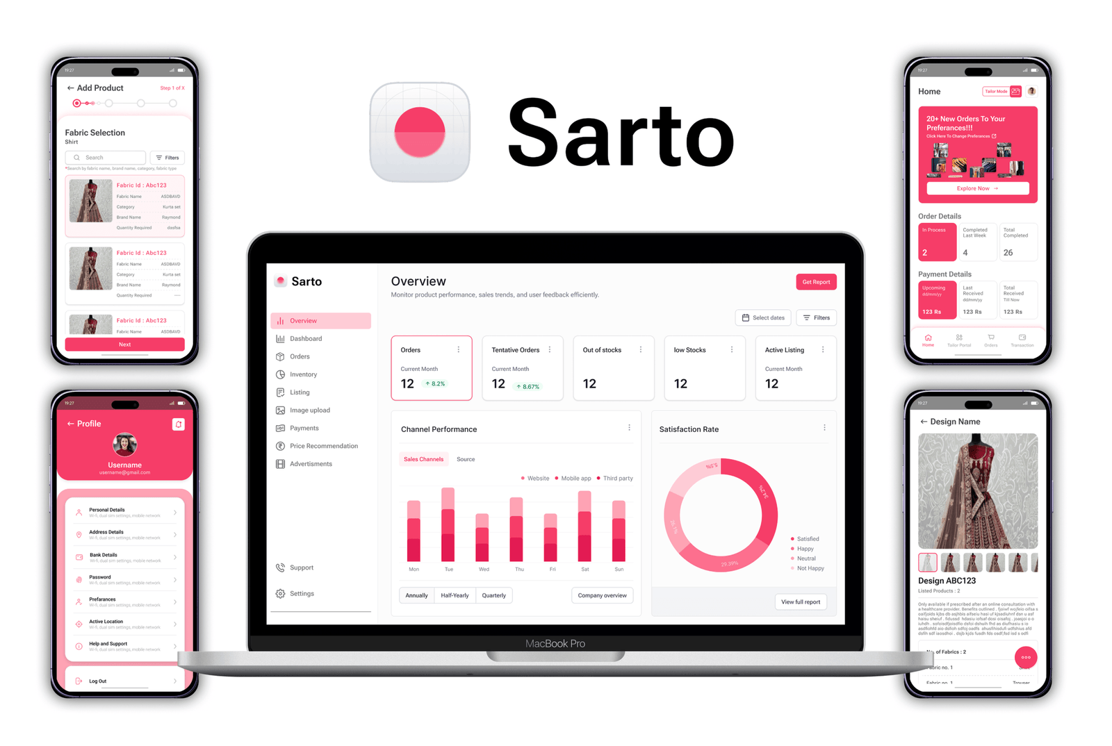
One product, two form factors. The phones carry the day-to-day work for whoever is holding one, and the desktop carries oversight: an Overview dashboard with orders, tentative orders, stock warnings and active listings across the top, channel performance split by website, mobile app and third party, and a satisfaction breakdown alongside it. The pink runs through both, so the admin dashboard reads as the same product as the app rather than a separate back office.
Designer
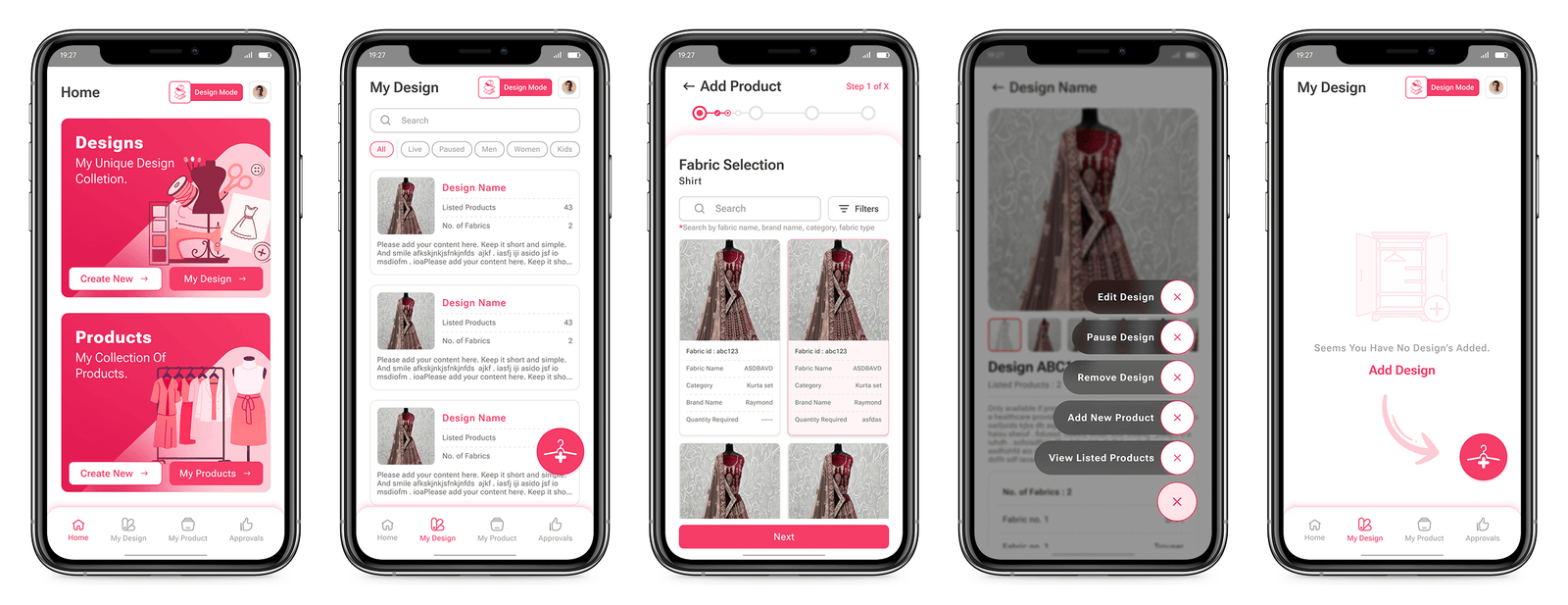
The designer's side splits immediately into two things they own, designs and products, and the list under each filters by status and audience in the same row (Live and Paused sit next to Men, Women and Kids, because in practice someone filters by both at once). Adding a product is an explicit numbered wizard rather than one long form, opening on fabric selection, since that is the choice everything else depends on. Actions on a design are collected into one radial menu rather than scattered as icons, and the empty state points at the button instead of just stating the obvious.
Tailor
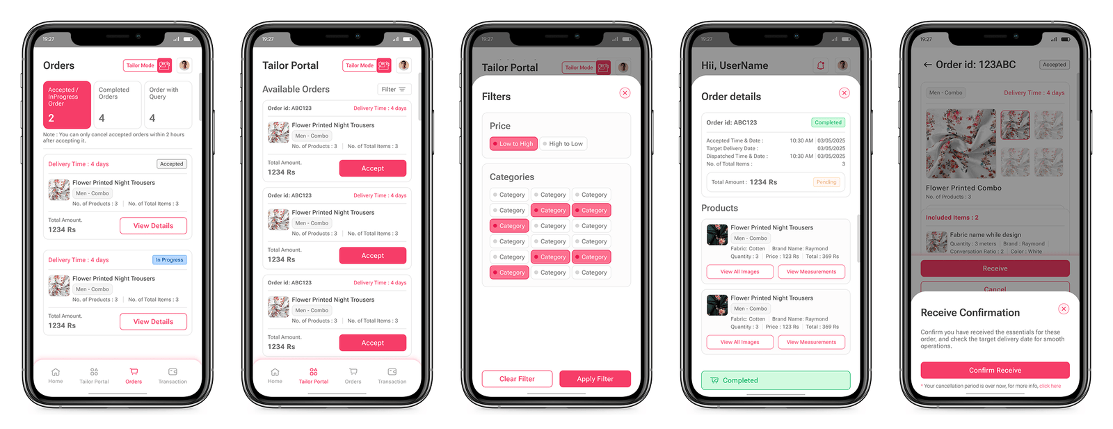
Tailor mode opens on a count of what is live, in progress, completed and queried, so the first thing on screen is workload rather than a list. The Tailor Portal is the opposite view, orders that are still available, each with delivery time and total up front so accepting is a decision, not a guess. Receiving is its own confirmation step rather than a status toggle, because it is the moment the cancellation window closes and someone else has already been sent out.
Fabric Manager & Delivery
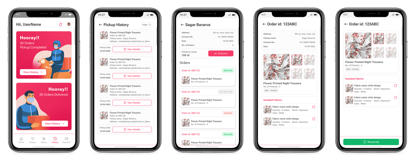
This role is on the move, so the screens are built around one action at a time and a big terminal button (Accept, then Received) rather than a form. The customer screen leads with distance away and a Direction button before the order contents, because the immediate question on a pickup run is how far, not what. History is a real, filterable list rather than a receipt, and completed runs get an explicit milestone card, which is the one piece of the product that exists purely to make a repetitive job feel like it is adding up.
Shared account, notifications and detail sheets
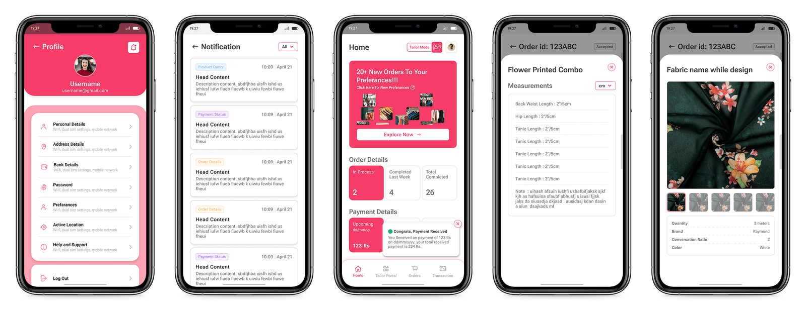
Everything that behaves the same regardless of which role you are in. Profile is one list covering personal, address and bank details plus preferences and password, so a designer and a delivery rider manage their account identically. Notifications are typed at the row level (product query, payment status, order details) so the list is scannable rather than chronological only. The measurement and fabric sheets are the payoff for the whole handoff chain: the exact spec that used to travel by voice, rendered the same way for whoever opens it.
Key Features
Fabric & Inventory Management
Seller Analytics Dashboard
Order & Payment Tracking
Buyer-Facing Product Browsing
Outcome
A Complete Product Design
I designed the full product for a private client, built for 5 distinct user roles across the seller dashboard and buyer-facing app. The client hasn't taken it into development yet. Product name, branding, and identifying details have been generalized to protect client confidentiality.
designed for
Reflection
The thing I did not expect going in was how much of this project was a handoff problem rather than a marketplace problem. The brief read as listings and search, but the moment I mapped who touches a custom garment, the real design work turned out to be the chain: making sure the fabric spec a designer picks survives intact to the tailor who cuts it and the rider who carries it. Every decision above is really about that chain holding.
I designed five roles from a description of five roles. I never sat with a tailor or went on a pickup run, and those are exactly the two people whose screens I was most confident about, which in hindsight is the wrong way round. The client also never took this into development, so none of it has been tested against a real order. If I picked it up again I would build the fabric and measurement handoff first, on paper if necessary, and check it against one real garment before drawing anything else.
Note: This project was designed by me for a private client, taken on directly rather than through an employer. It belongs to that client, and I'm sharing it here only to represent my own design work, and make no ownership claim over the product, its brand, or its code.