Overview
Booking a home visit means trusting a stranger to come into your house, often while you're in pain, before you've met them once.
Proper Care Physiotherapy is a home-visit physiotherapy clinic in Pune, clinically led by Dr. Krishna and a team of 12 physiotherapists, covering stroke rehabilitation, back pain, frozen shoulder, slip disc, post-operative recovery, sports injuries, and elderly mobility, 46 distinct treatments in total, delivered at the patient's own home. I designed the product across three surfaces: the public marketing website (propercarephysiotherapy.in) that a patient or family member finds and books from, a separate patient portal for tracking appointments and downloading bills, and a content system of recovery-guidance blog posts and downloadable exercise-guide PDFs. The site is currently being redesigned and expanded: a per-condition and per-neighbourhood page structure, an interactive service-area map, a real patient-review system, and an FAQ section, alongside the live version it will replace.
Problem Statement
Home-visit healthcare is a harder sell online than a walk-in clinic. Most visitors searching for this are in pain, recovering from a stroke or surgery, or booking on behalf of an elderly parent, and they're being asked to invite a therapist into their home before they've met anyone. On top of that, the clinic genuinely treats 46 different conditions across a growing service area, real breadth that risked reading as an overwhelming wall of text instead of a reason to trust the service, and appointments and billing were being managed by phone and WhatsApp with no self-serve way to check either.
- Most visitors are in pain, recovering from a stroke or surgery, or booking on behalf of an elderly parent, and are being asked to trust a stranger in their home before they've met anyone.
- The clinic genuinely treats 46 conditions across 16 South Pune neighbourhoods, real breadth that risked reading as an overwhelming wall of text instead of a reason to trust the service.
- Appointments and billing were phone-and-WhatsApp only, with no self-serve way to check either.
Challenges
Building enough trust for a visitor to invite a therapist into their home, especially for the most vulnerable patients: stroke survivors, the elderly, and people just out of surgery.
Presenting a genuinely wide range, 46 treatments across 16 South Pune neighbourhoods, without overwhelming a visitor who's often searching in pain or under stress, and short on patience for a wall of text.
Designing a patient portal simple enough for elderly patients and their family members to actually use, when the only two things they need from it are "when's my next visit" and "where's my bill."
Presenting real patient outcomes convincingly without turning the site into a wall of five-star quotes, and giving future patients an honest way to add their own experience rather than curating everything from the clinic side.
Solutions
Led with Dr. Krishna's real credentials (15+ years in neurological, orthopedic, and home-based recovery) and the size of the clinical team behind her, plus a free 45-minute first assessment to lower the barrier to booking at all.
Grouped the 46 treatments into seven categories with a live count on each (Core Services, Orthopedic, Neurological, Geriatric, Pain Management, Rehabilitation, Special Home Care) and gave every service area its own page, so a visitor confirms both what is treated and whether the clinic comes to them in seconds instead of reading a paragraph.
Designed the patient portal around exactly two tasks, view upcoming appointments and download a bill, so a family member checking in on someone else's care could use it just as easily as the patient.
Built a real patient-review system, moderated submissions alongside the clinic's own testimonials, plus an FAQ section answering the questions patients actually ask before booking (how soon can treatment start, who does the treating, is the first visit really free).
Design Decisions
01Led with the team, not the solo practitioner
What I didReframed the homepage and Overview around Dr. Krishna as clinical lead over a 12-person team, not the solo practitioner the earlier framing implied.
WhyA visitor trusting a stranger in their home wants to know there's a real, staffed clinic behind the visit, not one person doing everything themselves — team size is reassurance, not just a headcount.
What I’d do differentlyI'd want to see whether leading with the team size actually moves booking conversions, rather than just assuming it reads as more trustworthy — that's not something a redesign alone can confirm.
02Replaced fixed pricing packages with a per-condition model
What I didMoved off four fixed session packages (a single visit up to a 30-session plan) to 'sessions from ₹699, session count set by the condition, not a fixed package.'
WhyThe old packages forced someone to guess their own recovery length before they'd even had an assessment. The new model defers that commitment until after the free first visit, once there's actually enough information to price it.
What I’d do differentlyI'd want a few months of real bookings under the new model before calling it settled — a pricing change like this is easy to design and hard to validate without real patient behaviour.
03Added a real patient-review system, not just curated testimonials
What I didBuilt a moderated review-submission flow alongside the clinic's existing testimonials, plus an FAQ answering the questions patients actually ask before booking.
WhyA wall of quotes the clinic chose itself reads as marketing. A visible review system with real names is a different, more trusted signal — closer to what a visitor already trusts on other services.
What I’d do differentlyThe moderation step is manual right now — I'd want to see real review volume before knowing whether that stays fine or needs a lighter-touch process.
04Handed off a full admin panel for content and lead management
What I didBuilt an admin panel covering blog posts, treated conditions, service-area pages, downloadable resources, the photo gallery, patient reviews, inquiries, visitor analytics, and site settings, so the clinic can manage its own SEO-relevant content without a developer for routine updates.
WhyA home-visit clinic's real growth lever is local SEO, new condition pages, new service-area pages, new blog posts, and that only happens consistently if updating it doesn't require going through a developer every time.
What I’d do differentlyI haven't seen how much the clinic actually uses it day to day yet — an admin panel that's technically complete but too fiddly to use regularly would be a real gap I can't see from the outside.
05Gave every condition and every neighbourhood its own page
What I didRestructured the site from a handful of broad service pages into 46 individually addressable treatments and 16 neighbourhood service-area pages, each with its own headline, its own local pricing and response-time card, and its own FAQ and structured-data markup.
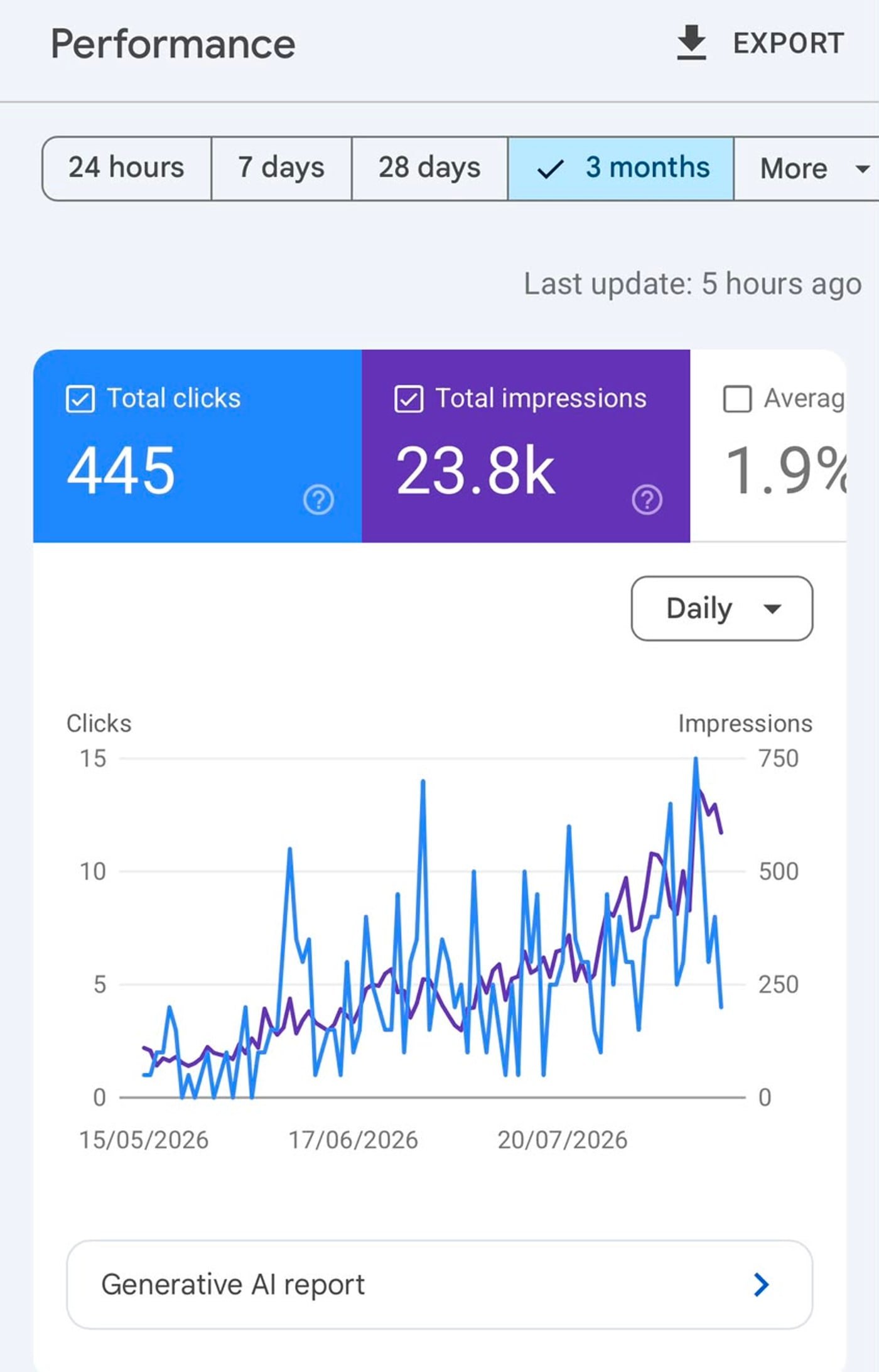
WhyNobody searches for "physiotherapy services." They search for "home physiotherapy in Katraj" or "frozen shoulder treatment Pune," and a page that answers exactly that question ranks for it and converts on it. This is the decision the search numbers actually reflect: 23,800 impressions and 445 clicks over three months, on a rising trend, from a site that previously had almost no organic presence.
What I’d do differentlySixteen location pages built from one template is close to the point where near-duplicate pages start hurting rather than helping. I would want to see per-page performance before adding more, and I have no read yet on whether the thinner ones are earning their place or just diluting the strong ones.
Screens
Homepage
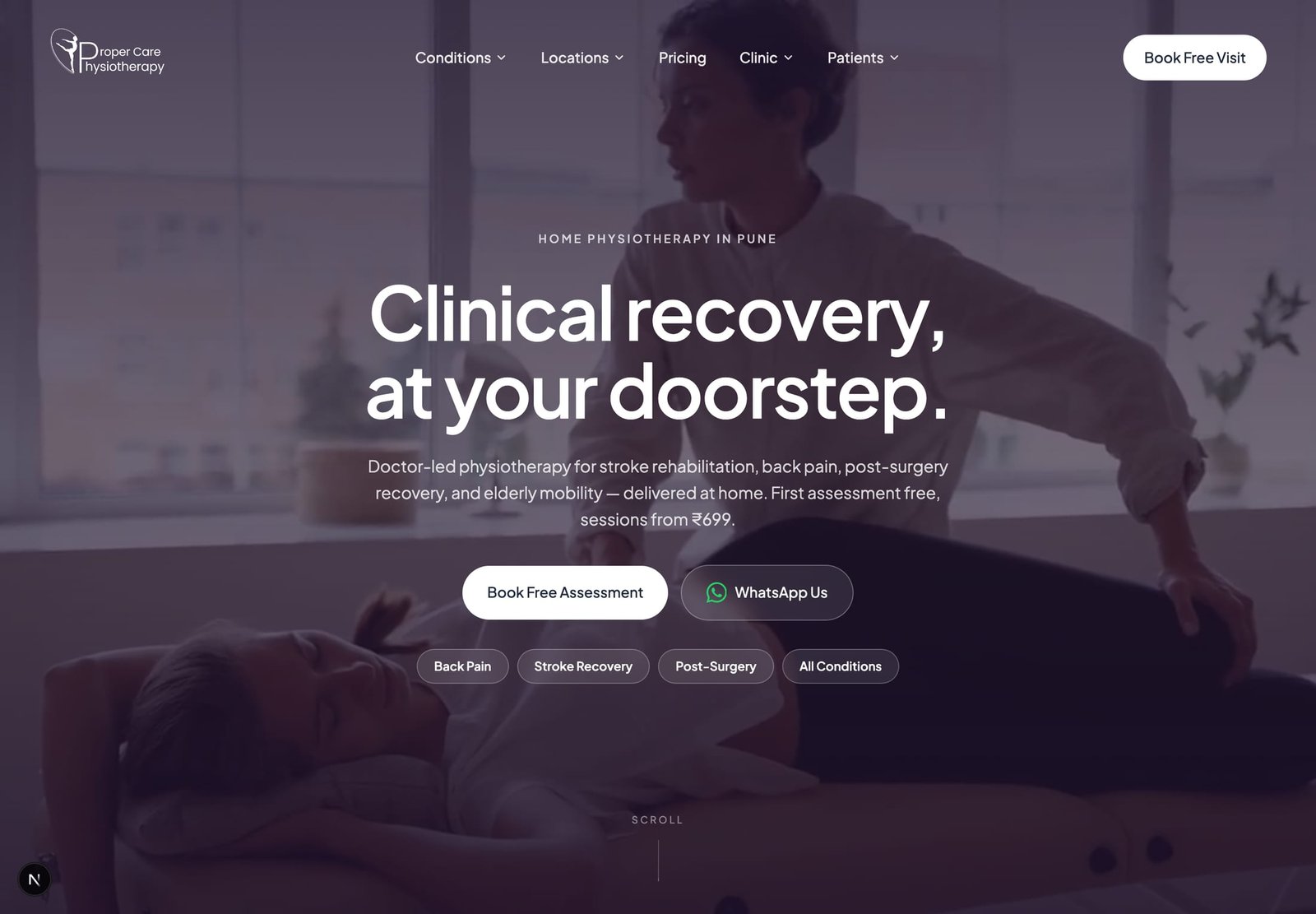
The hero commits to the two facts a visitor is actually deciding on: the therapist comes to you, and the first assessment is free. Under it, four chips jump straight to the most-searched conditions instead of making someone open a menu. The nav is organised the way patients think rather than the way a clinic is structured, Conditions, Locations, Pricing, Clinic, Patients, and the same free-assessment offer follows down the page as a floating call to action.
Conditions
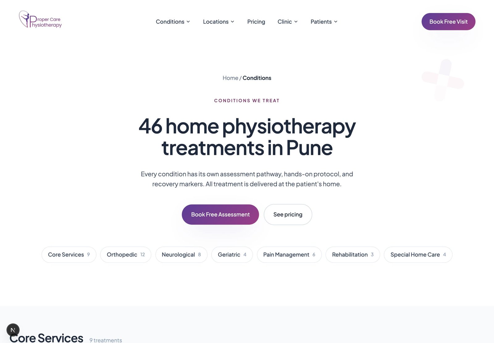
Forty-six treatments is the kind of breadth that reads as noise if it is a list. Grouping them into seven categories with a live count on each turns the same number into a signal of range, and lets a visitor narrow to the six or twelve entries that apply to them in one tap. Each condition then gets its own page with its own assessment pathway and recovery markers, which is what makes the depth searchable rather than just long.
Service area pages
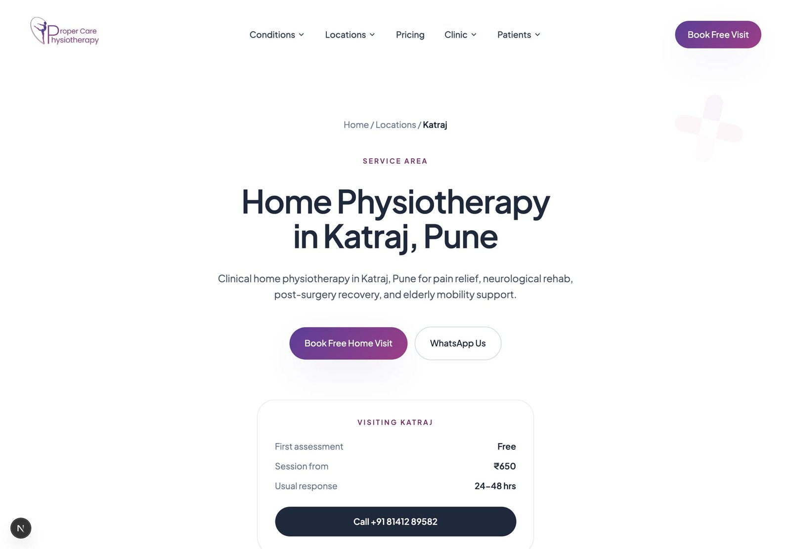
Sixteen neighbourhood pages, one per area the clinic actually covers, each carrying the same "Visiting {area}" card: what the first visit costs, what a session costs, and how quickly someone will hear back. The specificity is the point twice over, it answers the only question a local visitor has (do you come here?) without a phone call, and it is what search traffic for "home physiotherapy in {area}" lands on.
Booking
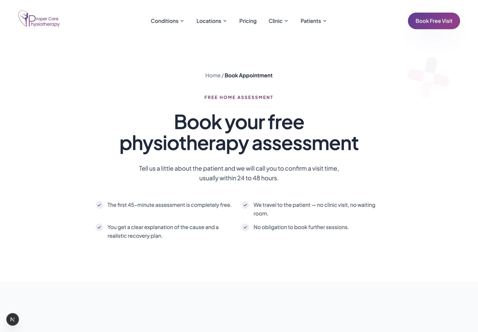
The booking page answers the objections before it asks for anything. Four checks sit above the form: the assessment is free, it happens at home, the cause gets explained in plain language, and nothing obliges you to book again. The form itself only collects what is needed to call someone back, and the page states the callback window rather than leaving a submitted form to feel like it went nowhere.
Search performance
The site's own Google Search Console report for the three months to 16 August 2026: 445 clicks and 23,800 impressions at a 1.9% average click-through rate. The shape of the chart matters more than the totals, it starts at roughly nothing in mid-May and climbs steadily, which is what a per-condition and per-neighbourhood page structure looks like as Google works through it. This is included as a screenshot rather than a quoted number because a traffic claim in a portfolio is only worth the source behind it.
Key Features
Marketing Website
Patient Portal
Appointment Booking
Patient Reviews
Blog & Exercise Guides
Outcome
Live, and Growing
The current site is live at propercarephysiotherapy.in with the patient portal running alongside it for appointment tracking and bill downloads. Over the three months to August 2026 it drew 23,800 search impressions and 445 clicks at a 1.9% average click-through rate, on a clearly rising trend, from a standing start. A redesign is underway that rebuilds the site around 46 individually addressable treatments and 16 neighbourhood pages, adds a real patient-review system, and builds out a library of recovery-guidance articles and exercise-guide PDFs.
website
Reflection
This project is still active. The version live at propercarephysiotherapy.in today is the smaller, earlier one; the richer version above, the team framing, the new pricing model, the review system, the admin panel, is built and running locally, not yet published. Writing this case study while the redesign is mid-flight means some of what's above is closer to "built and tested locally" than "proven in production."
I'd hold off writing the case study until after launch next time. Describing a redesign that's real but not yet live means some of these decisions are honest best guesses about what will work, not confirmed outcomes, and that's a harder line to draw clearly on the page.
Note: This project was designed by me for a private client, taken on directly rather than through an employer. It belongs to that client, and I'm sharing it here only to represent my own design work, and make no ownership claim over the product, its brand, or its code.