Overview
The one chart meant to tell a performer which gigs actually paid best was reading 100% Uncategorised.
TaskTrack is a personal redesign of an existing mobile app used by freelance event performers, people who work cocktail parties, weddings, and themed sets, to track their gigs and earnings. No client, no brief: I picked it apart because gig-based schedules and gig-based money are two very different kinds of data, and the app was flattening both into one generic home screen with almost no way to tell what was actually working. I rebuilt it as two focused dashboards, Insights and Earnings, against a single spacing and component reference so every screen shares the same grid, icon set, and colour tokens.
Problem Statement
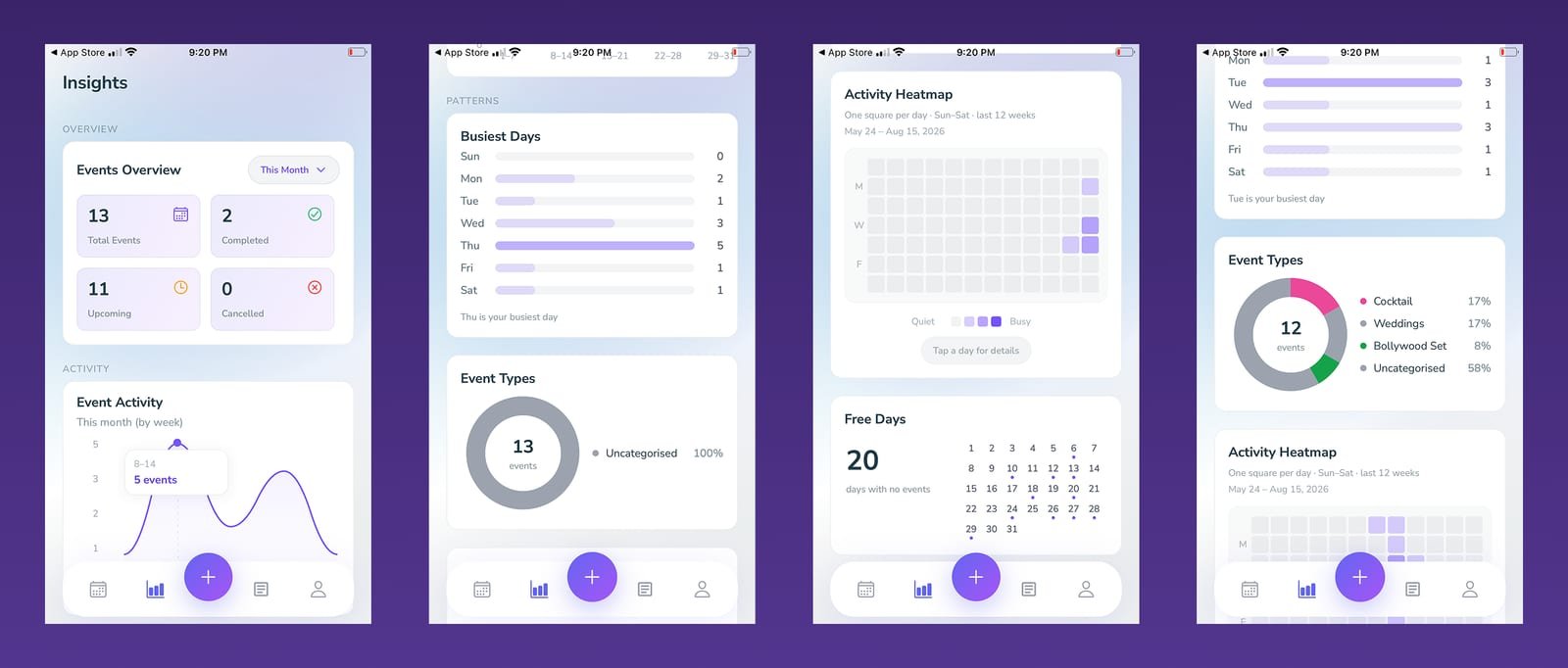
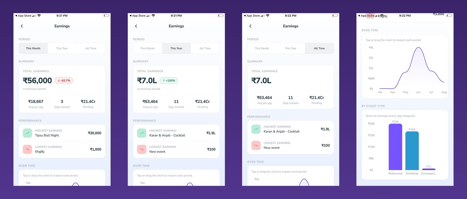
The old app's own numbers showed the problem. Its Event Types breakdown, meant to show what kind of gigs someone was actually doing, read "100% Uncategorised" in one period and 58% in another: the categorisation feature existed but almost nobody used it, so the one chart that should have told a performer what kind of work paid best was mostly blank. On top of that, the two areas of the app didn't even agree with each other: Earnings had a plain Month / Year / All Time toggle while Insights only offered a rough week-by-week scrubber with no matching year or quarter view, so the same person, in the same app, had two different mental models for "what time period am I looking at." A "Free Days" card just stated a number (20 days with no events) with no way to tap into any of them, and there was no way to see which clients actually kept coming back.
- The Event Types donut, the one chart meant to show which kind of gig paid best, read "100% Uncategorised" in one period and 58% in another: the feature existed, almost nobody used it.
- The two screens disagreed on time. Earnings had a 3-way Month / Year / All Time toggle; Insights had only a rough weekly date-scrubber with no matching year or quarter view.
- Free Days was a static number over a read-only calendar grid, nothing to tap, nothing to plan around.
- Nothing anywhere showed which clients kept coming back, even though the same client names repeat across separate gigs in the data.
Challenges
Splitting one overloaded home screen into two dashboards without either one feeling incomplete on its own. A performer opens the app for two very different reasons and needs a fast answer either way.
The old Event Types chart was real evidence that people weren't categorising their gigs at all, most periods read close to 100% "Uncategorised." Getting people to actually tag a gig's type meant making the payoff for doing it obvious, not just adding a required field.
Earnings and Insights ran on two different period controls, a 3-way Month/Year/All Time toggle on one, a vague weekly date-scrubber on the other, so switching what timeframe you were looking at meant relearning the control depending on which screen you were on.
Turning a passive "20 days with no events" number into a calendar someone could actually act on, tap a day, see what's already booked, instead of just a stat sitting above a read-only grid.
Solutions
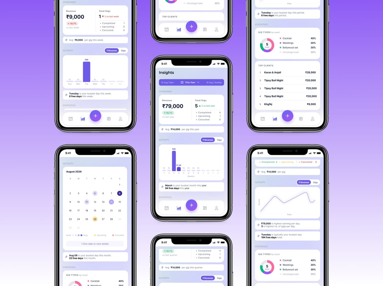
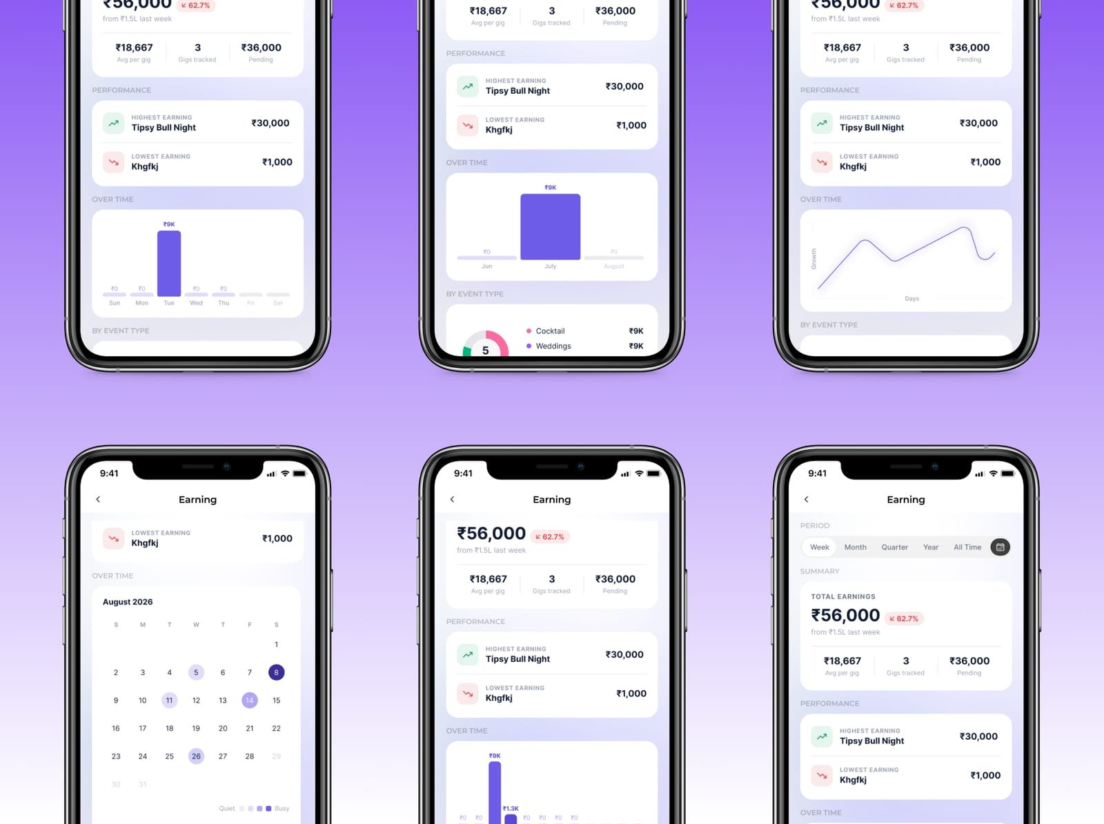
Split the redesign into an Insights dashboard (events, activity, busiest days, Top Clients) and a separate Earnings dashboard (revenue, performance, breakdown by event type), each with its own Revenue/Gigs toggle on the activity chart so one chart could answer either question instead of needing two.
Made the gig-type donut on Insights and the earnings-by-type breakdown on Earnings use the exact same chart pattern, live percentages, matched colours, instead of Earnings' old bar chart, so categorising a gig once now paid off visibly in both dashboards at once, not just a chart nobody checked.
Built one shared segmented period control, Week / Month / Quarter / Year / All Time, with a real date-range display above it, and reused it identically on both dashboards so switching ranges feels the same everywhere in the app.
Replaced the static Free Days counter with a real interactive month calendar, colour-coded for quiet, busy, upcoming and cancelled days, with "tap a date for details," so free time becomes something to plan around, not just a number to glance at.
Design Decisions
01Made categorising a gig pay off twice, instead of forcing it
What I didGave the gig-type donut on Insights and the earnings-by-type breakdown on Earnings the same chart pattern and the same colours, replacing the bar chart Earnings used for that data.
WhyThe old app didn't have a compliance problem, it had a payoff problem: tagging a gig fed one chart nobody checked. Making the same tag light up two different answers, what kind of work do I do and what kind of work pays, is a reason to do it. A required field would just have produced junk categories.
What I’d do differentlyI can't actually claim this works. The honest test is whether the Uncategorised share drops in real use, and a redesign with no users behind it can't tell me that. If I picked this up again I'd want that number before calling the decision settled.
02One period control, used identically on both dashboards
What I didReplaced the 3-way Month / Year / All Time toggle on Earnings and the weekly scrubber on Insights with a single five-step Week / Month / Quarter / Year / All Time control, plus a live date range above it.
WhyTwo controls for the same concept meant relearning the interface depending on which screen you were on. Five steps also covers a real gap the old app had at both ends: no quarter view for someone tracking a season, and no week view on the screen that most needed one.
What I’d do differentlyFive segments plus a calendar button is a lot to fit on a phone, and it is already tight at the narrow end. I would test whether Quarter earns its slot or whether a date picker alone covers that case.
03Turned Free Days from a number into a calendar you can act on
What I didReplaced the static "20 days with no events" card and its read-only grid with a real month calendar, colour-coded for quiet, busy, upcoming and cancelled days, with a tap-a-date affordance.
WhyA count of free days is trivia. What a performer actually wants is to look at next month and see where the gaps are, which is a scheduling question, not a statistics one, and it belongs in the shape of a calendar rather than in a stat card.
What I’d do differentlyFour status colours on a dense month grid is close to the limit of what stays readable, and I did not check any of it against a colour-vision simulation. That is the first thing I would fix.
04Added Top Clients, a ranking the old app had in no form
What I didAdded a ranked list of highest-earning clients to Insights, reading the repeat names already sitting in the data.
WhyThe same client names show up across separate gigs in the old app, but nothing anywhere added them together, so a performer had no way to see who was actually worth keeping. It was the one genuinely missing feature rather than a badly presented one.
What I’d do differentlyThe ranking is by revenue alone. Booking count matters just as much for a repeat relationship, and one big one-off can outrank a client who books every month, so a single sort order is probably the wrong answer.
Key Features
Insights Dashboard
Earnings Dashboard
Interactive Calendar
Event-Type Breakdown
Top Clients Ranking
Outcome
Two Dashboards, One System
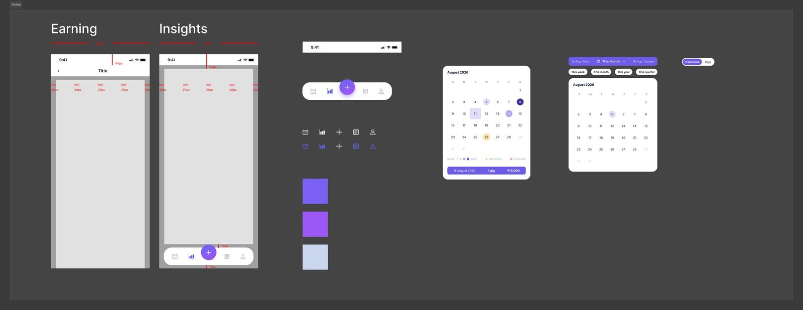
This was personal practice, not client work, redesigned end to end in Figma against a real spacing and component reference so an Insights dashboard and an Earnings dashboard, plus a new Top Clients ranking and an interactive calendar neither one had before, all read as one product built on one shared system.
from one shared system
Reflection
Redesigning an app I did not build turned out to be a useful constraint. I could not add features to escape a problem, so every fix had to come out of what the existing screens already showed me, and the strongest evidence in the whole project was the app's own chart admitting that its categorisation feature had gone unused. Reading a product's failures off its own dashboard is a habit I would not have picked up designing something from scratch.
I would find real users before redesigning anything. Everything here is reasoned from screenshots, which is enough to spot that a feature is not being used but not enough to know why, and "nobody categorises their gigs" has at least three different explanations that each point at a different fix. I would also start from the shared system rather than arriving at it: the spacing and component reference came together while I was already drawing screens, and a few inconsistencies survived into the final file because of that.